allen-zone
Wednesday, November 14, 2012
Friday, November 9, 2012
Project 3 Part 2 submission
In this final submission, i try to rethink about the concept
ideas from part 1 and refined it to be my schematic design, thus, i prefer to
show the rhythm of music and create a richly experience for people.
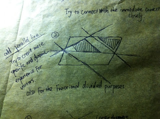
as a result, i using diagonal lines to divided the whole
site, try to connected the church st and market st, river and market st. Also,
i using triangular shape in order to create a more dynamic shapes for the music
theater. Moreover, i located the two main buildings - small theater and large theater in the middle of the site cause their are more important than any others buildings. connected with a service area between these two theaters in order to create a functional systems for entire space.
Monday, October 1, 2012
Weekly Progress Works
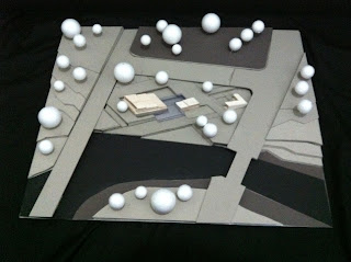
When i want to know the site context deeply, then i try to build 3d digital model and physic model according to the site topography i got at the moment,
Below is one option for my theater activities scenario, in this case, i focus on
how to subdivided the theater space and open space and use triangular circulation lines to connected each separated buildings according to the urban context.
Firstly, i used different color to indicated the fall of different level basically from 12m to 2m, thus, i can see the have a approximately 6m falling from Market street to Parramatta river.
Physical Model of the site context
Below is one option for my theater activities scenario, in this case, i focus on
how to subdivided the theater space and open space and use triangular circulation lines to connected each separated buildings according to the urban context.
As a result, i create several routes for visitors or artists walk around,
to be more specific, i intent to bring the Market street and Parramatta river together, then design a large ramp to be the open space for people walking from upper level to lower level.
Another options using Diamond shape try to create interactive routes around the site
Contract vs Expand
Compare last scheme this is more like outspread to each side, as you can see the four arrows indicated the expansion of activities.
Below is the Composition of Weekly Progress Works
Week 9 Progress Works
Week 10 Progress Works
Project 3 part 1 Submission
In this project, we try to figure out a conceptual idea
which can beautifully fit with the site context. My core idea is try to create
integrated architectural spaces for theatre activities and specific music
connected with the site context. as we all know, there are simply about 1000
square meters for the theatre space Compare with the huge open space in this
site. In other words, the area of site is over sixfold larger than the space of
theatre, which i should be carefully take advantage of these open space rather
demolish it without reason.
Main
Features:
1 try to create several connections between church
street, market street and marsden street. when visitors get into from church
street and have multiple options get out either from marsden st or market st.
thus, it can bring people a variety experience.
2 wide open space between each part of buildings
like cafe, small & larger theatre and rehearsal space etc. thus, i
want to defined a relaxing and dynamic feeling when people from public space to private space.
Final Conceptual Model & Poster
Monday, August 27, 2012
Week 1 Seymour Theatre Visiting
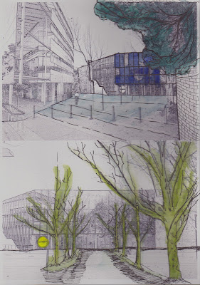
Approach: The entrance for the theatre was a little bit private which located on the corner of two road, in other words, it is a really quiet piazza have put some chairs and table for people take a rest.
Moreover, there are a IT building beside this theatre, which is triangular shape building, have a really great contrast with the cubic theatre.
Interior : basically this theatre have two level, lower level is for thicket counter and Cafe, and upper
level is theatre. furthermore, there are a ring-shape concrete staircase lead people to the upper level, and a lot of large glazed curtain wall fill up with the main facade, which means light have been distributed throughout the building.
York theatre: it is the largest theatre in the seymour and has a seating capacity of 780 in a semi-circular, amphitheatre configuration, featuring a thrust stage. thus, the space is ideally suited to the presentation of theatre works.
Sunday, August 26, 2012
Arch 1202 Project 2 Final submission
1 Site & Building : the eastern main facade opens up to Toolo bay. The actual entrance is located on the first storey of the side facing the park. It leads into the entrance hall, in which the cloakroom and various service rooms are located. Moreover, the wide " venetian stairway" leads to the foyer, from which one comes to the large hall, the small hall or the restaurant. Two smaller stairways lead out of the foyer into a type of gallery, from which one arrives at the tier of the larger hall.
2 Form Distortion : as can be seen from the diagrams, how the shape of building have been change from step by step. For one thing, it affects by the surrounding context such as the bay in front of building, the park beside the main entrance in the west . For another thing, Aalto's design concept has a strongly connect with the nature, thus, he has arranged the main entrance behind the park, he want people get in the building through nature in here is trees. Furthermore, large windows and concave recesses are on the western facade, serving to protect the old trees of the site and to enliven the facade.
3 Space : in these parti diagram : i simplify the complex ground plan in a geometric shape in order to the relationship between the solid and void space in terms of public and private space. thus, i filled the space with gradient colour from light grey to dark grey in order to indicated the space has been transform from public to semi-public till private space. as a result, the main hall and small hall can be consider as public space compared with the congress hall which seldom open to the public.
4 Structure & Circulation: i have isolated the structure columns from the ground plan in each level, then overlap all of them in order to see the arrangement of columns and how these affect the space around them.
Moreover, i prefer to show the circulation in 3D view which can be seen straightforward. Thus, i basically indicated three main route in this building which are main hall , small hall and congress hall. i used arrow to highlight the direction from the entrance till destination in order to figure out the routes between different levels and how it affect the space. Furthermore, it can also see the circulation through the main hall cross-section diagram, which shows two different way to enter the hall in terms of balcony on upper level and stage at lower level.
5 Facade : it can be regard as one of most interesting feature of this theatre, for one thing, the building's exterior are the great horizontal mass of the building proper and the towering auditorium that rises above it, thus, i isolated the long strip windows on the east and west facade, it shows the windows have been arrange in order which suggested the light must distributed even in interior space. For another thing, i also show the large scale towering auditorium facade compare with the strip windows to see how the shape have been created.
Subscribe to:
Comments (Atom)


